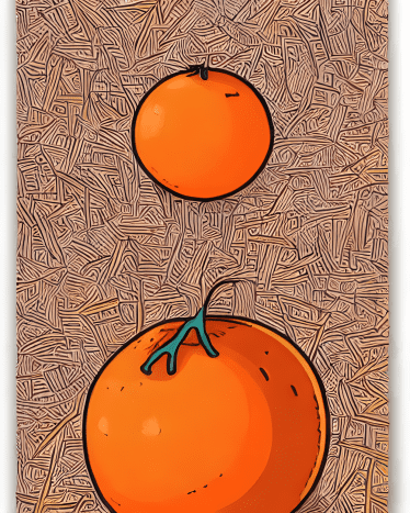
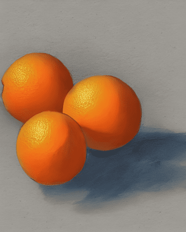
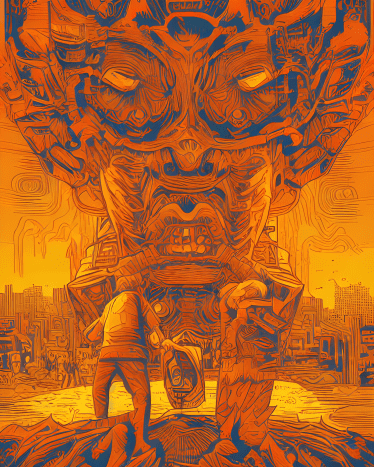
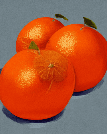
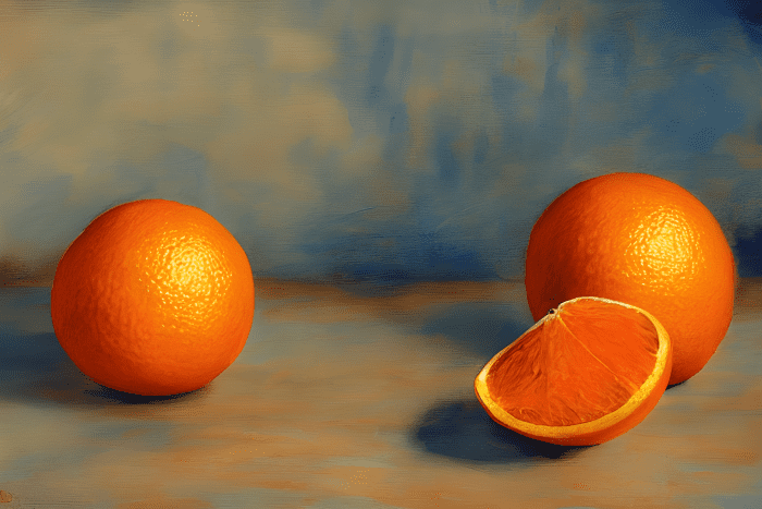
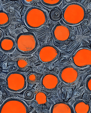
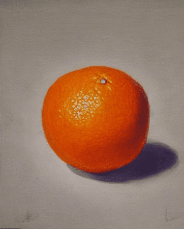
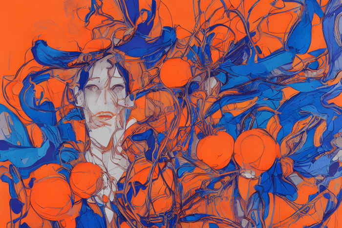
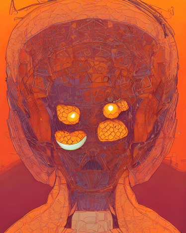
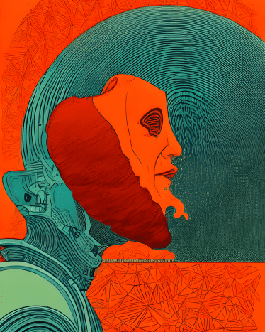
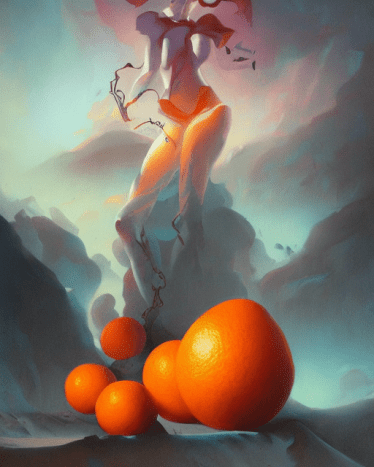
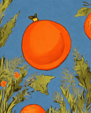
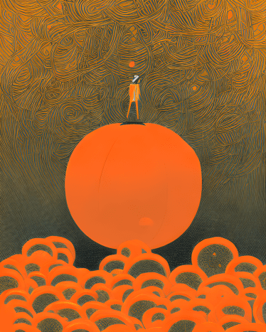
Original art by author using Stable Diffusion in StarryAI AI art generation allows us to create any image that we can imagine, simply by typing in a few words. The AI then creates artwork using sophisticated algorithms and machine learning techniques. This powerful new technology is already being used by designers, photographers, and even ordinary people to create stunning works of art. And it’s only just beginning! The future is full of potential for artificial intelligence to help us make amazing art.
Collaborations Between the Living and the Dead
One amazing thing about these programs is that they can create anything that you want, including a collaboration between artists living and dead! With these tools, you can bring your imagination to life. And there are numerous artists and art styles to choose from. You are probably reading this because you want to understand the different art styles that are possible in apps like StarryAI, DreamStudio and Dream by WOMBO. These art styles are all based on real artists of the past and present, such as Alphonse Mucha and Anna Dittmann. If you want to create AI art with more intention, you should know a little about the artists whose styles you want to emulate! You’ll find that many of them have distinct features and techniques that you can replicate to better create what you want. This article is a deep dive into some of the artists and styles you may have wondered about. Once you have a good sense of these styles, you can use them to make your own original AI art. Try experimenting with different prompts and see what you can come up with!
Today’s Theme: “An Orange”
To give you a good sense of the effect these styles have on a piece of art, I have created all of them using the same simple prompt: “An orange.” Each section below will tell you a little about each artist or style, and then describe the effect each style has on the finished artwork.
Alena Aenami
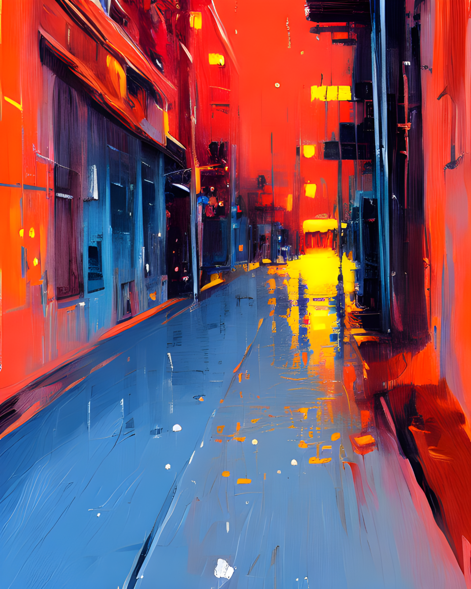
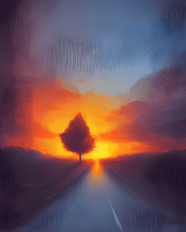
Alena Aenami is a contemporary digital and concept artist from Zaporizhia, Ukraine. She works primarily on game concepts, album cover art and digital illustrations. Her clients include Passion Pictures, Procreate, Wizards of the Coast, Nexus Studios, LofiGirl and Roof Studio. She is mostly known for her paintings of beautiful city and natural landscapes. Her art is very colorful and bright, often with futuristic looking environments and sometimes containing a human figure. In the below images, although the color orange is used in profusion, an actual orange is nowhere to be found! Nevertheless, Alena Aenami’s style is very apparent in the urban and rural landscapes and bright colors. The Alena Aenami style is particularly good for any image in which you want vivid, almost neon colors, especially of landscapes or cityscapes.
Alphonse Mucha
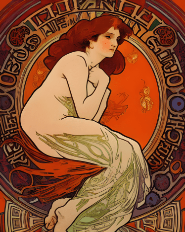
Alphonse Mucha was a Czechoslovakian-French painter and poster designer and one of the leading artists of the Art Nouveau Period. Art Nouveau was a European art movement popular around 1900, and it influenced everything from furniture, interior design and architecture to posters, glass, pottery and textiles. The work of Alphonse Mucha was characterized by sinuous lines, women with long flowing hair and elegant lettering (a hint of which can be seen in the first image below, albeit illegibly). Alphonse Mucha’s art ranged the gamut from theater bills and window displays to exotic interiors and even advertisements for commercial products, such as cigarettes. I think the style of Alphonse Mucha is a beautiful style and adds elegance to any image, especially those including women. In fact, if your prompt doesn’t include women, this style will probably add them, as seen below. In this case, the style interpreted the phrase “an orange” to mean the orange color, not necessarily the fruit. The style to me is reminiscent of the look of stained glass windows, and, probably not coincidentally, the work of Louis Tiffany, the famous stained glass artist, also belonged to the Art Nouveau style.
Anna Dittmann
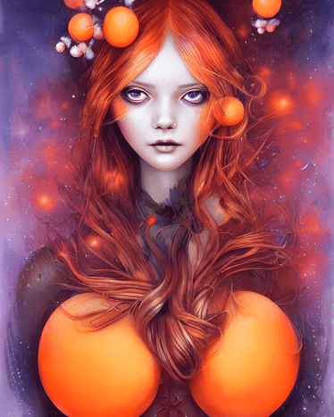
Anna Dittmann is a contemporary digital illustrator and freelance artist from San Francisco who now lives in Scotland. She specializes in stylized portraits, especially of women. Her work draws inspiration from movement, organic shapes and natural elements, or what she calls “figurative art.” The Anna Dittmann style is strongly reflected in the orange-themed artwork shown here. The oranges played in perfectly with the artist’s love of organic elements. The style produced a portrait of a woman while cleverly incorporating oranges into each image. While the second image is a bit disjointed and incoherent, I think the other three images were quite successful. Consider using the Anna Dittmann style when producing images of women.
Asaf Hanuka
Asaf Hanuka is a contemporary artist living in Israel. In addition to writing and illustrating comic books, he teaches at Shenkar College of Engineering, Design and Art. His style of line drawing is typical of that of comic book artists, but with his own unique twist. In the samples below, you can see his influence. However, while all of the samples look like line art, it is debatable whether it really captures the style of Asaf Hanuka. It’s more cartoony than Hanuka’s style of art, which is more realistic. Also, some of the samples below lack coherence. Ironically, it seems that AI art has a harder time creating coherent line art than it does with other genres of art, such as painting. Perhaps it needs more training in this genre of art. The first image below looks like a pair of oranges in front of a crosshatched background, but the second image is less clear. Is it a man wearing glasses being picked up by a giant hand? I interpret the third image as a man in a boat with a cargo net full of oranges behind him, but the final image is all but impossible to make out. You can use this style when you want to generate the look of line art, but I don’t think you’ll likely confuse it with actual work by Asaf Hanuka.
Concept Art
Concept art is pretty much what it sounds like: conceptual or planning illustrations for something under development, such as an animated film or a video game. Some concept art may be created using a computer, but in the olden days, everything started with a pencil, and sometimes it still does. Conceptual artists sketch out what a character or scene might look like in the finished product. Then, other artists take it from there, using the sketches as inspiration and guides for the final piece. In the below images, you can see some of the influences of concept art by the appearance of pencil strokes, shading and sketching, especially in the second image. The fact that all the images are on a gray background may be a nod to the fact that some artists traditionally sketch out their ideas on gray illustration board.
Dan Mumford
Dan Mumford is a contemporary artist based in the UK who specialises in fantasy-based art. His artworks are usually large in scale, and many of them feature large, mythical monsters like dragons and warriors wearing cool-looking armor. He also likes to show epic scenes of conflict and drama with vivid colours and bold composition. He is known for a unique style that combines fantasy and sci-fi themes. His style is often described as “gritty” or “dark” fantasy. His works are usually dominated by one or two colors. In the samples below, you can see his influence in the vivid orange color used in the images. The final image looks something like a poster and combines orange and blue in a pleasing manner. Only two of the images show actual oranges, but all use the color orange in some way. Use this style when you want to give your work a bright, poster-like, sci-fi look.
Digital Painting
At first, I thought the term “digital painting“ to describe AI generated artwork was silly. Isn’t all artwork done on a computer or computerized device “digital?” Usually, digital painting tries to re-create the look of traditional media, such as watercolor, oil, charcoal, pencil, etc. Since digital painting can simulate almost any media, why specify this as the style? After using AI generated art for a while, I came to a clearer understanding of the term “digital painting.” It is used to specify that the art should have a painterly feel and not look overly literal or representational, like a photograph (a look which AI art is also capable of creating). But why not just specify that the artwork should have a painted look, you ask? Because often the AI takes that term literally and shows the art in a frame, as if it is hanging on a wall or in a museum! Obviously, digital painting is usually not framed, so this is a good way to specify that you want that painterly look without worrying about the finished image looking like it is part of an art exhibition! In the following images, you can see the look that “digital painting“ gives AI-generated art. The first image is highly detailed; you can even see the texture of the oranges in the painting. The third and fourth are more abstract, but have an aesthetic composition. I especially like the blue and orange color combination of the third piece. No matter what other styles you specify for your artwork, specifying “digital painting” can help give the finish piece a more “artistic” look.
Fantasy Art
Fantasy art is a broad category, but most of it is set in a magical world that’s different from our own. It contains mystical elements like magic or supernatural creatures like monsters or elves. The fantasy world can be based on historical times, like Rome, the Middle Ages, or any type of time period or place the artist wants. Fantasy art can range from very realistic to highly-stylized, but most of the time it’s a mix of the two. It’s also very often based on magic, wizards, dragons, elves, orcs and fairies, and often set in mystical locations, but it can also take place in regular modern or medieval landscapes. There are many different sub-genres to fantasy, such as Sword & Magic, which takes place in ancient or medieval times and features knights, mages, dragons and other magical/fantastical creatures as its primary subjects. High-Fantasy takes place in the same settings, but the main focus is on grander/larger-scale stories that portray epic quests, battles and war. Needless to say, AI generated art is generally very good at creating fantasy art, because it has been trained on the work of a lot of fantasy artists. However, the subject of “an orange” does not give it a lot of fantasy to grab onto! In the below images, some of the oranges appear to be floating and others appear to be clinging to the wall. That is the most fantasy that Stable Diffusion could insert into images of oranges in this particular instance. I would say that the third image shows the most fantasy elements, but Clip-Guided Diffusion, another AI art generation engine, is generally better at inserting fantasy into the most mundane topics. With the right subject matter, however, inserting “fantasy art” into your prompt will give fantastical results!
Hyper-Detailed
The “Hyper-Detailed” style is a genre of art that is is highly textured, with seemingly millions of tiny details in every part of the image, creating a very rich and lush visual. The artist usually uses many small brush strokes and blends colours very precisely for the artwork to look as realistic as possible. Theoretically, the artwork created in this style is very intricate, with lots of tiny details like individual hairs and small objects. A lot of time and effort is spent on the painting/illustration to make every part of it look as perfect and real as possible. This style could also be called “hyperrealistic” or “ultrarealistic.” The artists who create such artwork are generally highly skilled, and their patience gives them a very high level of focus and attention to detail. My experience with using Stable Diffusion to generate fruit is that a lot of detail is added to the background, but the surface of the fruit is relatively plain and simple. I was surprised that it added thousands of tiny details, like cross hatching, to the background, but not much to the orange itself. Maybe there’s not that much detail you can add to an image of an orange? The AI does seem to do better with certain images than others, and I’m not sure why, but there’s a lot more potential for it to create a highly detailed image of an armored space marine with a huge sword compared to an orange. I think the AI is trained with more or better pictures of space marines than oranges. There’s less of a “frame of reference” for the “fruit look;” a lot of images in the image library contains elaborate backgrounds with architecture and other details, such as landscapes, so when it comes to generating those, more of the “training data” is applied and the results are generally better. However, with the right subject matter, this style should live up to its name.
Hyperrealism
You might ask what the difference is between hyper-detailed and hyper-realism. They are listed in the catalog as two separate art styles for Stable Diffusion, but at first glance, they do sound like two slightly different ways of saying pretty much the same thing.The way I see it, “Hyper-Realism” is a very precise attempt to recreate a subject that exists in the “real world”, in the same amount of detail and with the same proportions that the subject has in real life, whereas “Hyper-Detailed” is a less strict style, which still tries to create a image of high detail (and has a strong resemblance to the original subject) but is not required to recreate the subject with as great a degree of accuracy. Hyper-realism in art is an art genre that aims to create extreme detail and fidelity to the real world. It aims to look so realistic that the resulting art piece looks exactly like reality, if the artist can achieve that, they’ve created hyper-realism art. I’ve generated images before using the hyperrealism art style, the images I generated has a very realistic high definition quality to it, and a high level of detail to the generated images. Photorealism is a style of art that shows things as they are in the real world, it’s almost identical to a photograph. Hyperrealism is very similar to Photorealism, but it shows the details of the subject even more than a photo can show, that is why it’s “hyper” realism.
James Jean
James Jean is a contemporary Taiwanese artist who now lives in Los Angeles. His style is realistic yet highly fantasy-inspired and surrealist, with a lot of vivid colors and sharp angles. His subjects are often women. To me, this style as applied to AI artwork is slightly reminiscent of the style of James Jean. It is not as coherent, the faces are not as good and it is not nearly as detailed as the art of its namesake. Unfortunately, many of the lines in the style are added merely for the sake of adding lines, without providing any additional information or “story.” What the style does is add lots of bright, flat colors, usually dominated by one or two hues, and lots of lines that can be seen as decorative but don’t actually add any detail. The style does lend a unique look; you can tell by the samples below whether you would like to use it in your own art. One plus is that all the images below do contain actual oranges!
Josan Gonzalez
Josan Gonzalez is a contemporary artist living in Spain. His style has elements of cyberpunk and biopunk. Cyberpunk is a genre of science fiction depicting a dystopian world dominated by computer technology. Biopunk is similar, but focuses on biotechnology rather than mechanical or information technology. Gonzalez draws detailed futuristic city landscapes, space ships, and lots of crazy looking monsters and cyborgs. His work is marked by flat colors and highly detailed line art. When I first saw the art generated by this style, I thought the influence must be of a comic book artist. I was just slightly off the mark. Josan Gonzalez is a world-renowned artist with a huge online following, mainly on Instagram and ArtStation. As with the work of Dan Mumford and James Jean, this style adds a lot of lines that can be seen as decorative without necessarily adding a lot of detail. In contrast, with the work of the actual artist, every line adds detail and actually means something. So the style creates the illusion of being highly detailed without necessarily living up to that in reality. In the first image below, the style cleverly added the orange theme to the cyborg’s eye’s, but in other images, it fell back on implementing the color orange without including the actual fruit. You can judge from the samples below whether or not you like the look the style adds to your art.
Kilian Eng
Kilian Eng is a contemporary artist living in Sweden. His art is mostly done in a digital medium. His style is very detailed and is a dark blend of fantasy and realism with powerful emotions and disturbing symbolism. His work almost looks like poster art to me. Outline art, vivid colors, and lots of details—something that would make a good poster that you might want to hang on your wall and look at often. As with several other artists described here, this style as applied to AI art creates a lot of lines that can be seen as purely decorative without adding a great deal of detail or information. Two of the images can be seen as portraits, while the other two are totally abstract. Only one of the images unmistakably adds an orange, as opposed to merely utilizing the orange color. Still, this style create some interesting and aesthetic images if you are looking for a more abstract or cyberpunk look.
Peter Mohrbacher
Peter Mohrbacher is a contemporary artist living in the United States. Well-known for his fantasy artwork, he’s done illustrations for the card game Magic the Gathering. He’s a well-known science fiction/fantasy artist and his style is surreal and has elements of bio/cyperpunk. His style is painterly and has lots of fantasy details, like detailed futuristic spacesuits, for example. He creates unique human and alien characters in fantasy scenes, his art often featuring a mix of highly realistic settings with surreal dreamlike creatures and monsters. He produced an art book called “The Angelarium” which is a series of amazing surreal fantasy paintings of angels, demons and archangels. In the below images, you can certainly see the influence of Peter Mohrbacher. Each image is dominated by a human (or human-like) figure with somewhat muted colors and are all pretty surrealist. They have also all picked up on the prompt pretty well, with each image containing actual oranges! On the minus side, they lack the exquisite detail of Mohrbacher‘s work, some of the figures lack coherency and in a couple of images, their heads are cut off by the top of the frame! This could be a good style for surrealist fantasy work, but it will not be confused with actual work done by Peter Mohrbacher.
Storybook Illustration
Storybook art is a very pretty, romantic style that is based on the art of children’s stories. It tends to create art in a very simplistic, child-like, and clean style. It is a style of very colorful, highly detailed and quite cute images. It’s a very friendly style of illustration that captures a very dreamy, imaginative mood. The style is traditionally used to illustrate fairy tales and folklore stories of monsters and magic. The colors are very gentle and soft, and a lot of the characters have a sweet, kind disposition. They feel like they belong in a fairy tale, and like they are from some magical world where everything is beautiful and lovely. The subject matter of a lot of the images is very fanciful, often with magical creatures and fairies. The style captures a simpler time. It tends to look more like it was created with traditional, rather than digital media – media such as watercolor, tempera and the like. The samples below are an illustration of this. They have a certain texture to them, as if they were picking up the roughness of the paper they were painted on. All of them contain oranges, and the last one even threw in a book for good measure! Use the storybook illustration style when you want to create an innocent and childlike look for your images.
Victo Ngai
Victo Ngai is a contemporary artist who was born in Hong Kong, graduated from Rhode Island School of Design and is now based in Los Angeles. “Victo” is not a Chinese name, but a nickname – a shortened form not of Victor, but Victoria. She is a Forbes 30 Under (Art and Style) honoree and Society of Illustrators New York Gold Medalist. Victo Ngai is another artist who does extremely detailed, highly precise artwork. There is a lot going on in her images! She does very stylized work, with a lot of dark colors and sharp lines. She seems to specialize in a line art style – very sharply delineated, very clean, very hard-edged. It almost looks like it was done in a vector art program like Adobe illustrator, but of course done always with style and finesse. As with a lot of the other artists described here, this style adds a lot of lines that can be seen as decorative but do not necessarily add a lot of detail, but it can add some interesting and creative twists to your image. All of the images utilize the orange color, and most of them have orange shapes, although not necessarily recognizable as an orange. The second image had some interesting decoration that looks like the branches of a tree, while the fourth image looks something like a Christmas ornament!
Watercolor
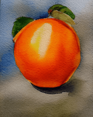
The watercolor style is very abstract and it is very loose—the art work is very free flowing, and the colors are often blended together. I think the watercolor style is romantic. It can make a mundane subject look poetic. The colors are very transparent, and when one overlaps another, you can see through it for a dreamy effect. What makes watercolor unique is the thinness of the pigments used. You can very much see the texture of the paper through a watercolor image. A lot of water is used (hence the name) which causes the pigments to flow freely. In the hands of a skilled watercolor artist who knows how to control it, the water itself determines a lot of how the pigment flows. This style does a great job of capturing the look of a watercolor image. I would guess the style was trained on a lot of images in this genre. It has even succeeded in capturing the texture of the paper! Watercolor is one of my favorite styles. So there you have it! I hope you have found this essay useful in comparing the different approaches of these artists by applying their styles to a single concept! You can really see how each artist’s unique style influences the creation of each image, and how they each add their own twist to the same prompt. This is an interesting way to explore and study the different ways in which artists interpret and create their art by experimenting with different concepts. I believe that AI art generation offers a lot of potential for artists and non-artists alike. With more and more people gaining access to this technology, I think that we will see a lot more creative uses for AI art. AI art generation is constantly evolving, so take this guide with a grain of salt- what you get with each style may not always be exactly what you expect! But it’s a great place to start, and will help you understand the basics of each style so you can create even better AI art of your own. So don’t be afraid to experiment and be creative—you just never know what new and amazing insights you might discover! And that, in and of itself, is an adventure—the journey is more important than the destination.
A Few Recipes
This content is accurate and true to the best of the author’s knowledge and is not meant to substitute for formal and individualized advice from a qualified professional.
